


BOHO
Cliente: Boho
Year: 2021
Pt
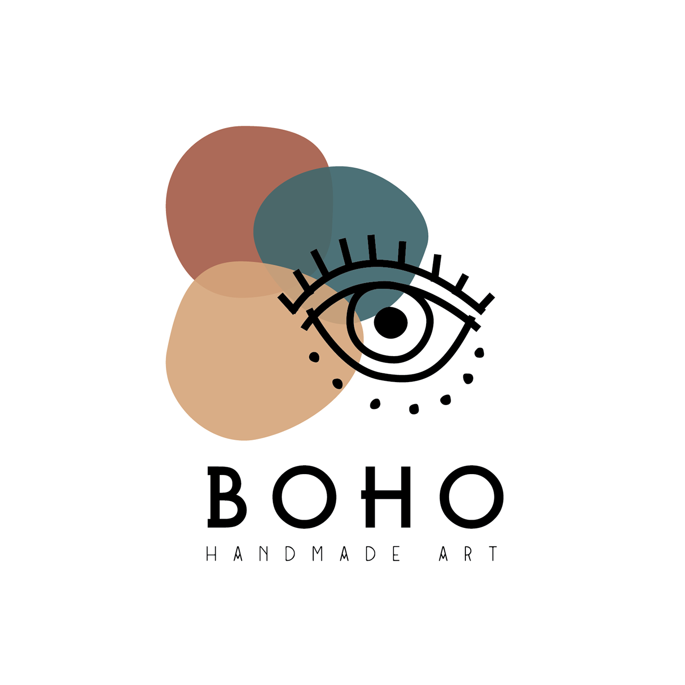
A BOHO é uma pequena start up portuguesa que aposta na criação de produtos artesanais em macramé e a sua única forma de venda é através da rede social Instagram. Assim desenvolver uma identidade que transmita todas as vibes da marca e da jovem que a gere e produz as peça é essen- cial. Para isso procurou-se uma paleta cromática que remetesse para as tonalidades mediterrâni- cas e joviais. O recurso às transparências permitiu a introdução de várias camadas de texturas e uma dimensão dinâmica na identidade visual. O recurso a duas tipografias permitiu aumentar o dinamismo da composição. A utilização do olho turco como símbolo na composição gráfica foi um pré-requisito do cliente que pediu esta referência em particular por se identificar com o seu significado e considerar que resume a marca de maneira coesa e completa. Desenvolver um logotipo que transmitisse uma sensação de boémia foi um desafio bastante interessante.
A BOHO é uma pequena start up portuguesa que aposta na criação de produtos artesanais em macramé e a sua única forma de venda é através da rede social Instagram. Assim desenvolver uma identidade que transmita todas as vibes da marca e da jovem que a gere e produz as peça é essen- cial. Para isso procurou-se uma paleta cromática que remetesse para as tonalidades mediterrâni- cas e joviais. O recurso às transparências permitiu a introdução de várias camadas de texturas e uma dimensão dinâmica na identidade visual. O recurso a duas tipografias permitiu aumentar o dinamismo da composição. A utilização do olho turco como símbolo na composição gráfica foi um pré-requisito do cliente que pediu esta referência em particular por se identificar com o seu significado e considerar que resume a marca de maneira coesa e completa. Desenvolver um logotipo que transmitisse uma sensação de boémia foi um desafio bastante interessante.
En
BOHO is a small Portuguese start up that bets on the creation of artisan products in macramé and its only form of sale is through the social network Instagram. So developing an identity that conveys all the vibes of the brand and the young woman who manages and produces the pieces is essential. For this, a chromatic palette that referred to the Mediterranean and youthful tones was sought. The use of transparencies allowed the introduction of several layers of textures and a dynamic dimension in the visual identity. The use of two typographies made it possible to increase the dynamism of the composition. The use of the Turkish eye as a symbol in the graphic composition was a prerequisite of the client who asked for this particular reference because he identified with its meaning and considered that it summarizes the brand in a cohesive and complete way. Developing a logo that conveyed a bohemian feel was a very interesting challenge.
BOHO is a small Portuguese start up that bets on the creation of artisan products in macramé and its only form of sale is through the social network Instagram. So developing an identity that conveys all the vibes of the brand and the young woman who manages and produces the pieces is essential. For this, a chromatic palette that referred to the Mediterranean and youthful tones was sought. The use of transparencies allowed the introduction of several layers of textures and a dynamic dimension in the visual identity. The use of two typographies made it possible to increase the dynamism of the composition. The use of the Turkish eye as a symbol in the graphic composition was a prerequisite of the client who asked for this particular reference because he identified with its meaning and considered that it summarizes the brand in a cohesive and complete way. Developing a logo that conveyed a bohemian feel was a very interesting challenge.

